


You spent hours perfecting that brand color on screen, but when you check the print proof, it looks completely wrong. Your lamp made the vibrant orange look like a dull brown, and now the client is unhappy.
A designer's LED desk lamp must have a high Color Rendering Index (CRI) of 90+ to accurately show colors, ensuring that what you see in your workspace matches the final product.
This isn't just about brightness; it's about truth. Let's dive into why your most important design tool might be your lamp.
What is Color Rendering Index (CRI) and Why Should a Designer Care?
You're trying to choose between two shades of blue. Under your desk lamp, they look almost identical. But when you take them to the window, you see one is a cool-toned cyan and the other is a warm ultramarine.
CRI measures how accurately a light source reveals the true colors of an object compared to natural sunlight. For designers, a low CRI lamp distorts colors, leading to poor design decisions.
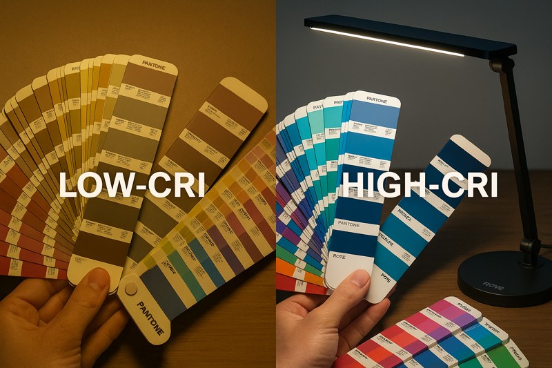
I'll never forget a meeting I had with the head of a small but very prestigious design agency in the UK. He was a potential customer, and he was deeply skeptical. "A lamp is a lamp," he said. "I just need it to be bright." I had brought one of our new pro-series lamps with me. I asked him to pull out a recent project that had color-matching issues. He brought out a beautiful brochure where the main brand color was a deep, rich red. He said, "We could never get this red to look right in the office. It always looked slightly brown." I switched on our lamp and positioned it over the brochure. There was a moment of silence. The red on the page suddenly popped. It was vibrant, deep, and true. I explained that natural sunlight has a CRI of 100. It shows perfect color. Most office lighting and cheap LEDs have a CRI of around 80. They are missing about 20% of the color spectrum, especially deep reds. Our lamp, I told him, has a CRI of over 95. He just pointed at the brochure and said, "This is the first time I've seen the true color of my own design indoors."
Seeing the Full Spectrum
A lamp doesn't create color; it reveals it by bouncing light off an object. If the light source is missing certain wavelengths, you will never see the true color.
Understanding the CRI Scale
The Color Rendering Index1 runs on a scale from 0 to 100.
- CRI 100: Perfect color rendering, identical to natural midday sunlight.
- CRI 90-99: Excellent color rendering. Used in professional settings like design studios, art galleries, and photography, where color accuracy is critical.
- CRI 80-89: Good color rendering. Acceptable for general home and office use but not for color-critical tasks.
- CRI < 80: Poor color rendering. Colors will appear washed out, dull, or shifted in hue.
The Importance of R9 (Rendering of Red)2
CRI is an average of how a light renders several colors. R9 is a specific score for how well it renders deep red. This is famously difficult for LEDs. A lamp can have a CRI of 85 but a very low (or even negative) R9 value, making all reds, oranges, and even skin tones look dull and unnatural. For a designer, a high R9 value is just as important as the overall CRI score.
Let's compare common light sources.
| Light Source | Typical CRI | Typical R9 (Red) | Effect on Design Work |
|---|---|---|---|
| Natural Sunlight | 100 | 100 | The gold standard; perfect color accuracy. |
| Incandescent Bulb | ~98 | ~95 | Very good, but inefficient and produces heat. |
| Standard Office Fluorescent | 70-85 | 10-40 | Poor; distorts colors, especially reds and yellows. |
| Cheap "White" LED Lamp | ~80 | Often very low | Unreliable; creates color matching errors. |
| Roye Lamp Pro-Series Lamp | >95 | >90 | Excellent; provides true, reliable color for professional work. |
As a manufacturer with a commitment to independent R&D, we focus on engineering light sources that don't just illuminate, but reveal the truth. For a designer, that truth is everything.
How Does Light Quality Affect Different Design Disciplines?
A graphic designer is matching Pantone colors for a print job. A UI/UX designer is creating a digital palette on a calibrated monitor. A product designer is evaluating physical material samples. They all need "good light," but their needs are different.
The specific demands of each design field require different lighting considerations. Print designers need high CRI for proofing, while digital designers need glare control to see their screens accurately.
During a large lighting fair, our booth was next to a company that sells high-end calibrated monitors for designers. I spent some time talking to their product manager. He told me their biggest customer support issue wasn't the monitors themselves, but the customer's environment. "A designer will spend thousands on a color-accurate monitor," he said, "and then view it under a $20 lamp that washes everything out in yellow light. Or they have a window behind them causing massive screen glare." He was fascinated by our lamps that offered not just high CRI, but also full adjustability and anti-glare features. I showed him how the lamp head could be positioned to cast light on documents next to a screen without spilling onto the monitor itself. I demonstrated how our diffusion panel creates a soft, even light that doesn't create a reflection. He realized that our products solved his customers' problems. "You're not just selling a lamp," he said. "You're selling a vital piece of the color-managed workflow. The lamp is the bridge between the digital world and the physical world."
Tailoring Light for Your Creative Workflow
A professional lamp should be a flexible tool that adapts to the specific task at hand.
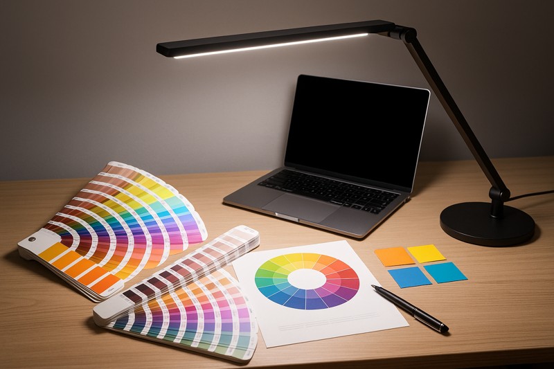
For the Print & Graphic Designer
The primary challenge is matching screen to paper. This requires a light source that mimics the final viewing environment as closely as possible, which is typically a D50 or D65 daylight standard.
- Critical Need: The highest possible CRI (>95) and a high R9 value. This ensures that the colors on your print proofs, Pantone books, and material samples are rendered with absolute fidelity.
- Key Feature: A neutral color temperature (around 5000K) to replicate the standard for graphic arts.
For the UI/UX & Digital Designer
The primary challenge is viewing the screen without interference. Glare on the screen changes the perception of contrast and color.
- Critical Need: Glare control. The light source should be indirect and should not create reflections on the monitor.
- Key Feature: A fully articulating arm and swivel head. This allows the designer to position the light perfectly to illuminate their desk and keyboard without shining on the screen.
For the Product & Industrial Designer
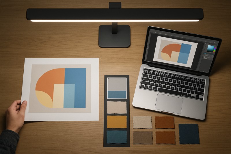
The primary challenge is evaluating the form, texture, and color of physical objects.
- Critical Need: A large, even pool of light. This helps reveal the shape and contours of a 3D object without creating harsh shadows that obscure details.
- Key Feature: Adjustable brightness. The ability to see how a product looks in both bright and dim lighting is essential for evaluating its real-world appearance.
Let's see how the right lamp addresses these needs.
| Design Discipline | Primary Goal | Low-Quality Lamp Problem | High-Quality Lamp Solution |
|---|---|---|---|
| Graphic Design | Accurate Print Matching | Distorted proof colors | High CRI & High R9 |
| UI/UX Design | Accurate Screen Viewing | Screen glare and reflections | Anti-Glare & Articulation |
| Product Design | Accurate 3D Form/Texture | Harsh, misleading shadows | Wide, Even Light Pool & Dimming |
A truly professional designer's lamp is not a one-trick pony. It must be a versatile, precision instrument that serves every part of the modern design process.
Beyond Color, What Makes a Lamp a True Design Tool?
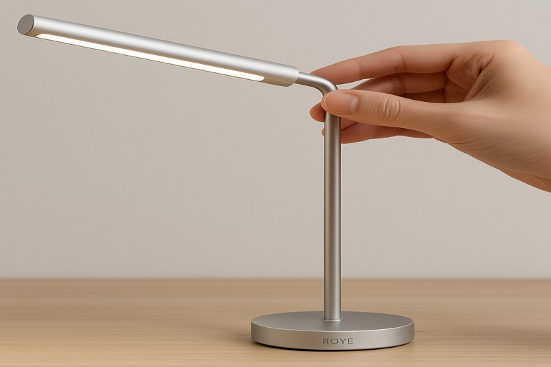
You have a lamp with perfect color rendering, but the base is huge and takes up half your desk. The on/off switch is clumsy, and the arm is stiff and hard to position precisely where you need the light.
A great designer's lamp must blend form and function. It needs a minimal footprint, intuitive controls, and a highly adjustable arm to become a seamless part of the creative workspace.
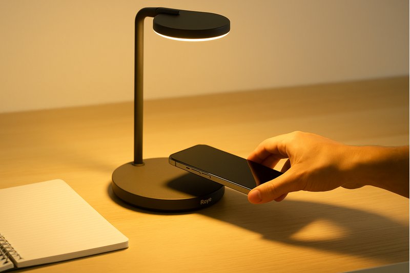
I was once giving a product demonstration to a buyer for a chain that supplies high-end office furniture. Their customers are architects and interior designers. He looked at one of our professional lamps and, before I even talked about the light quality, he ran his hand along the arm and tested the motion of the joints. He tapped the base. He was evaluating it as a piece of design in itself. "Designers buy for designers," he said. "My customers are curating a space. Every object in it has to have a purpose and a point of view." He was impressed by the lamp's minimalist aesthetic, the stability of the weighted base, and the smooth, silent movement of the articulating arm. Then I showed him the integrated Qi wireless charger in the base. I explained that we also believe that good design solves problems. By integrating the phone charger, we declutter the desk, removing a visual distraction. "That's it," he said. "It's not just a beautiful object. It's a smart object. It understands how a designer works."
The Ergonomics of Creativity
A design tool should feel like an extension of your hand and mind. It should never get in the way.
Design Feature: Minimal Footprint, Maximum Reach
Designers work with large cutting mats, sketchbooks, and multiple devices. Desk space is sacred.
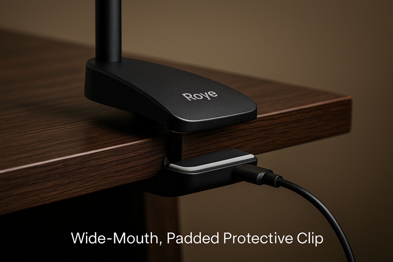
- Small, Weighted Base3: A heavy but compact base provides stability without consuming valuable real estate. A clamp-on base is another excellent option for maximizing clear desk space.
- Long, Articulating Arm: The lamp needs to be able to reach across a large work surface, providing light exactly where it's needed, whether it's over a keyboard, a sketchbook, or a product sample.
Design Feature: Intuitive & Unobtrusive Control
When you're in a creative flow, you don't want to fumble for controls.
- Touch Controls4: Simple, touch-sensitive controls for brightness and color temperature are more fluid and faster to use than physical buttons or knobs.
- Memory Function: A great lamp will remember your last-used brightness and color setting. When you turn it on, it instantly returns to your preferred work state without needing to be readjusted every time.
Let's break down the features that elevate a lamp to a design tool.
| Feature | The Problem It Solves | Impact on Workflow |
|---|---|---|
| Clamp-on or Small Base | Desk space is cluttered and limited. | Frees up valuable workspace for creative tasks. |
| Multi-Joint Articulating Arm5 | Light is needed in different spots at different heights. | Allows for precise, effortless positioning of light. |
| Touch Controls with Memory | Fumbling with switches breaks concentration. | Enables instant, seamless adjustment. |
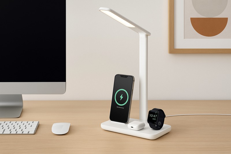
| Integrated Wireless Charging6 | Phone charger adds visual and physical clutter. | Maintains a clean, organized, and focused desk. |
A lamp for a designer must be thoughtfully designed on the outside as well as the inside. It has to perform its function flawlessly while complementing the creative environment it inhabits.
conclusion
For designers, a high-CRI, well-designed lamp isn't an accessory; it is the foundation for accurate and efficient creative work.
-
Understanding the CRI is crucial for anyone working with color, as it affects how colors are perceived under different lighting. ↩
-
R9 is vital for achieving true color representation, especially in design work, making it essential for professionals. ↩
-
Explore how a small, weighted base can enhance stability and save desk space, crucial for any creative workspace. ↩
-
Discover the advantages of touch controls in lamps, making adjustments seamless and enhancing your creative flow. ↩
-
Learn how a multi-joint articulating arm allows for flexible lighting, essential for precise work in design. ↩
-
Find out how integrated wireless charging can declutter your workspace, keeping it organized and efficient. ↩
